Matting and Framing Japanese Prints(The Basics)
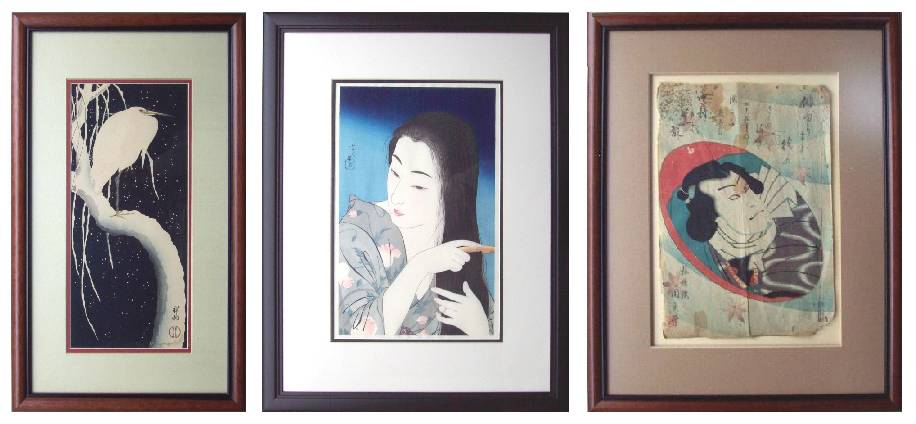
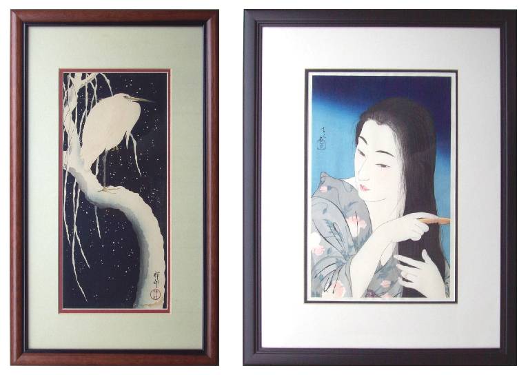
Three "Personal Collection" Prints: A Koson, a Kotondo, and a Kunisada
Introduction
Frequently, we find ourselves being asked by collectors the seemingly simple question, "What's the 'best way' to frame a Japanese woodblock?" What follows then, are practices that we've learned and developed over the years--including some basic conservation techniques, some cost-saving suggestions, and some aesthetic considerations.
Some Conservation Basics
The first and foremost consideration that should always remain firmly in the collector's mind the cardinal rule "to do no harm" to one's woodblock prints. Stated another way, nothing should be "done" to a print which is damaging, or is not reversible. The importance of this underlaying principle of conservation is easily appreciated when one simply takes the time to realize that we are really not the "end owners" of these beautiful, antique works of art. Instead, as "collectors," we are merely there current "holders"--since other, earlier collectors had earlier enjoyed them, and they will surely someday be passed down to successive future generations of collectors long after we have left this mortal earth.
What this "to do no harm" credo means to the collector and to the framer is really quite simple. Woodblock prints should not be trimmed or otherwise cut, glued down, colored, or otherwise altered from their natural state. Additionally--and important to the framer--woodblocks should not be exposed to anything other that acid-free matting materials, remembering that this also applies to a print's "backing" material. Finally, if and when displayed, woodblocks should be placed in such a manner or location where their exposure to harsh and damaging light is minimized.
Much has been written about specific conservation techniques, so we will not attempt to re-cover that ground here. However, when you take you Japanese print to a frame shop to have it matted and framed, be sure to ask some questions: Do they use only acid-free matting AND backing materials?? Will they use "paper hinges" to mount the print? Or, as an alternative, will they be using small pieces of archival (acid-free) tape? In any case, make sure that they understand that your print is not just "artwork," but rather, is a valuable, hand-printed antique worthy of both their careful handling and respect.
Choosing the Right Frame
The first decision one must make is usually that of choosing "the right" frame for their Japanese print. Here there are, of course, many choices at hand--but over the years we have found ourselves returning time and again to one conclusion that nearly always makes this decision quite simple: Japanese woodblocks are by themselves so beautiful that they do NOT need a decorative or flashy frame to show them off. Rather than "competing with" the woodblock print for the viewer's attention, it is nearly always preferable to use a simple, basic frame which merely "contains" the artwork. To our eyes, 95-percent of the time that means a simple black or brown frame. Black "always works," plus it offers the further advantage being that as additional prints are added to a wall display over time, a grouping of all black frames always seems to look good together (and are easily matched).
Another consideration when choosing a frame is whether to choose wood or metal. Either is fine, but we have found that wooden frames have one big advantage if one is desiring to later alternate or "rotate" several different prints using the same frames. As you can see in following picture, your frame shop can easily equip the backside of your frame with several thin, turnable "easy open" metal closures which can be easily opened (with a screwdriver) allowing the displayed print to be changed within minutes. By alternating the display of a series of prints through a given frame over time, not only does the viewer have "new artwork" to view, but also, a single print is not left exposed for a lengthy period of time to excessive fading.

Wooden Frame's Backside with "Easy Open" Metal Closures
A final consideration when choosing a frame is one of "size"--and this often translates into the practical decision of choosing between a pre-made "off-the-shelf" versus having a "custom-built" frame made. Fortunately for the Japanese print collector, most Japanese woodblocks will fit "quite nicely" into standard-sized, "pre-made" frames--and this can save you a lot of money. For most "oban-sized" prints (image size about 9/10 by 14/15 inches), a standard 16 x 20 inch frame will work quite adequately, leaving adequate frame space for 2 to 2 1/2 inch wide matting margins. In the case of smaller "chuban" prints (image about 7 x 10 inches), usually a standard 12 x 16 frame will be found to be similarly satisfactory.
Matting--A Matter of Aesthetics
Turning next to the question of matting one's print, we again find ourselves nearly always returning to the basics--namely the use of simple colors. Again, the idea is to not "compete with" the woodblock for the viewer's attention; all that is usually needed is a simple choice of minimal colors. Admittedly, this is of course a matter of personal tastes and aesthetics, and the reader is certainly follow his or her own heart when it comes to choosing colors. However, having seen (and tried) dozens of different color combinations, we nearly always end up with the conclusion that it's best usually just "keep it simple."
What this means in terms of "mat color" is that the wide area of a frame's matting area should not be "eye-catching" or overly strong in color. If an actual "color" is chosen, it should usually be kept VERY light in tone. However, in a vast majority of applications, we strongly believe that the correct aesthetic choice is to use an off-white or cream color. In fact, more often than not, here it seems that the most pleasing choice is to simply MATCH this wide mat's color with that of the woodblock's "margin (natural) paper color."
A final decision when matting a print is deciding whether to "single mat" or to "double mat" the artwork. Of course, the use of two mats will cost more, but it seems (at least to our eyes) that a majority of the time the addition of a narrow 1/4-inch inner "trim mat" will significantly enhance and "offset" the print itself. Having nearly always already decided (earlier) on the wider "face mat's" color (off-white or cream, as above), here's where the choice of colors comes into play. To help you with this process, nearly all frame shops will have on hand several dozens (if not hundreds) of variously colored "L-shaped" corners which can be held together (in combinations) against the artwork until the choice is made (see below).
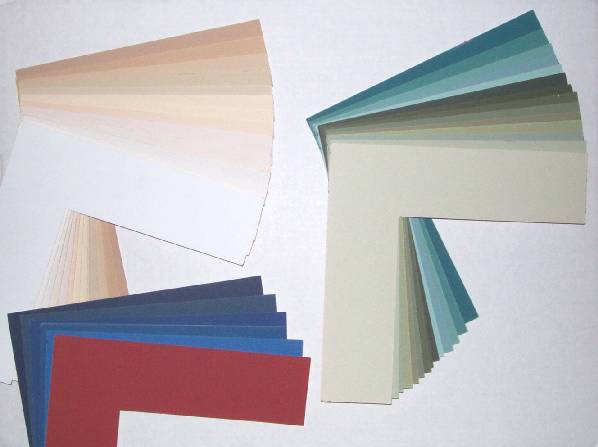
A Rainbow of Colors to Choose From.....
The "trick" of choosing the "right" color which will complement the artwork is, fortunately, usually "right before your eyes." If desiring to use a "color," it is aesthetically most pleasing to simply choose (that is, to "match") from among several of the colors SEEN IN THE PRINT itself. By choosing from and carefully matching one of your print's existing secondary colors, you will find that your matting "ties in with" and compliments the print--rather than competing with it.
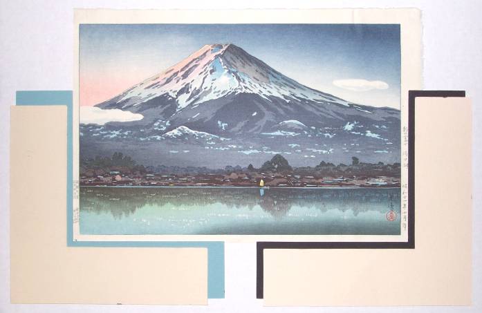
Here's an Example Trying the use of "Black" Compared with one of the Print's "Existing Colors"
With many prints, you'll find that final color choice comes down to selecting from among several choices, as you can see in the "bijin-ga" print just below. In this case, it seems that really any of the 4 possible choices would be quite pleasing. So, the final ("best") decision often comes down to personal tastes and aesthetics. However, if in doubt, remember that "black is always a good choice" (especially so if the outer frame is black itself).
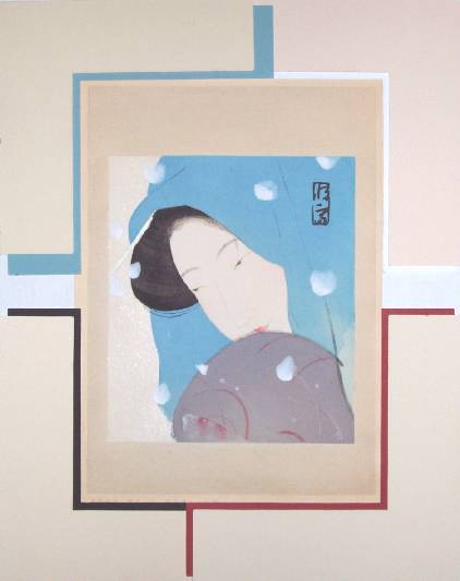
Another Example--Four Choices: Comparing the use of "Black" with Three of the Print's "Existing Colors" (You decide...)
How Wide the Margins??
A final question to be answered with respect to a framed print is "How wide should the matting be?" Generally speaking, for standard "oban-sized" Japanese prints (image about 9/10 x 14/15 inches), the wider "face mat" should normally be somewhere in the 2 1/2 to 3 inch wide range, although variation is certainly acceptable and can be a matter of personal taste. With smaller "chuban" prints, slightly narrower margins (perhaps in the 1 1/2 to 2 inch range) seem appropriate. Finally, if framing an even larger print such as a 14 x 28 inch three-panel triptych, then wider margins of perhaps 4 to 6 inches will be found to be appropriate. In the end, it's all a matter of "balance"--which generally means the larger the print itself, the wider the frame's margins.
Normally a print's margins should, of course, also be "roughly equal" on all sides. If one is choosing to use a standard "off the shelf" frame (for economy), this will sometimes require a bit of "fudging," with the resulting side margin's width sometimes being a bit more or less than the top/bottom margins. All one needs to do is to simply play around with it a bit, until the print itself comes "into balance" within the framing area. The only real "rule" of matting being that IF there is "extra space" (width), it should be placed at the BOTTOM side of the print. You can remember this "rule" by thinking of this extra space/width as a visual "anchor"--which then belongs at the "bottom."
These same generalizations also apply if one is choosing to have a "custom made" frame built. In this case, it's best to have equally-sized margins on THREE of the sides (both sides and top margins), and then remembering to ADD perhaps an extra 1/2 to 1 inch (for small or medium prints) to the bottom margin. In the case of larger prints (large oban or triptychs), then perhaps 1 1/2 to 3 inches (wider) is more appropriate. Again, it's all a matter of "balance," with the extra width being added to be print's bottom edge giving it a slightly "anchored look." (Study the examples in this article.)
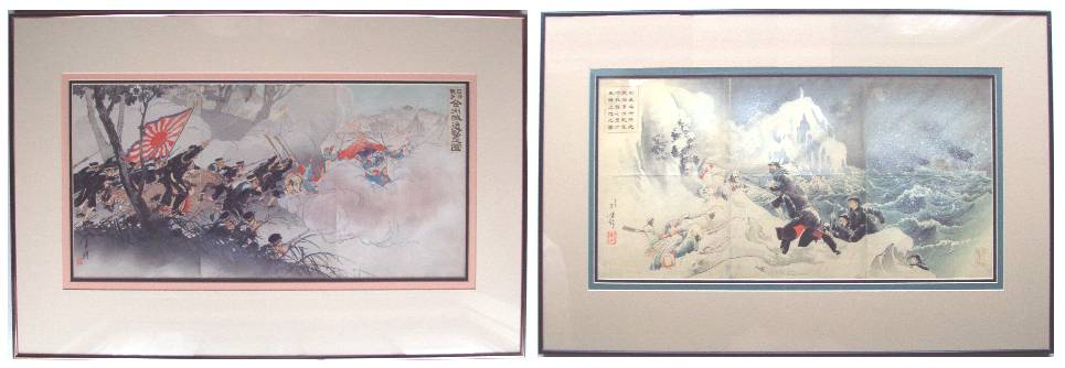
Triple-matting for Larger Prints
Just as you will find that as in most cases "double-matting" will enhance the appearance of a standard-sized framed print, you may also discover that "TRIPLE-matting" a very large print is equally appealing. Here, due to a triptych's overly large size and complexity, the thoughtful use of TWO narrow inner "trim mats" can be used effectively to offset the print from its much wider "face mat." When triple-matting a large triptych print, we have found a 1/4-inch inner black mat in combination with a second 1/2-inch wide colored mat to be visually appealing. These two narrower "trim mats" are then set off from the frame itself with what is typically a much wider 4 to 6 inch (neutrally colored) "face mat." Take a look at the matting below of the two Sino-Japanese War triptychs to get an idea of how this looks in practice. Note also, both of these larger triptychs were framed using a standard "off the shelf" 24 x 36 inch frame; the cost-savings being considerable.
A Final Word on Matting
One final observation we would like to point out is the recurring use of black as used together in both a print's matting and framing. Here, we have found that by using black in BOTH the mat's narrow "trim" color and the outer frame, that a sense of simplicity and continuity is achieved. Hence, you may have perhaps already noticed the (pleasing, we think) pattern of "black-cream-black-cream, then print" to be frequently used. (That's BLACK frame, CREAM wide "face mat," BLACK narrow "trim mat," CREAM (natural) print's paper color, with finally the print itself in the center.) The result is often both very simple and very striking.
Putting it All Together....
OK then, "putting it all together," here are a few examples of what we then think that an "attractively framed" Japanese print should look like. Again: Simple, basic frames. Wide "face mats" using print's natural color. And "trim mats" using a print's secondary color (or black).
Framed Examples Using Print's "Existing Color" and using "Black"
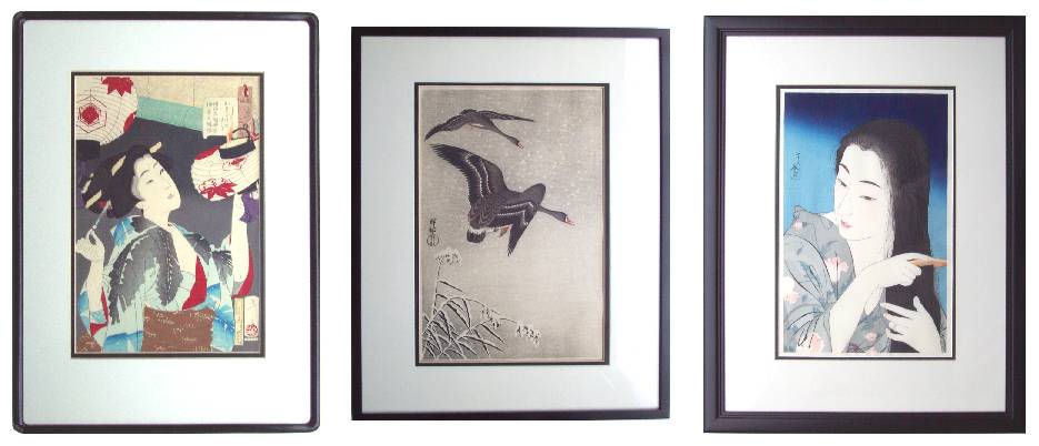
More Framed Examples--Remember, "Black ALWAYS Looks Good"
Framing Larger Diptychs and Triptychs
Next, we'll now turn our attention briefly to the challenges of framing of multi-print "diptychs" or "triptychs." Really, pretty much all of the same considerations as mentioned above still apply. About the only real difference is in the application of the matting if displaying more than one print within the same frame. This usually comes down to the decision of whether to use "one window" (mat opening) or "two windows"/"three windows" in the case of diptychs or triptychs.
Generally in the case of multi-print images, the individually printed sheets must themselves be placed fairly closely together to achieve "continuity" of image and thusly appear attractive. Although it can be done, in most cases this usually means NOT placing the individual prints into their own separate frames. Depending on whether the several sheets composing the single print image are already "joined" (attached)--or if they instead are "loose sheets"--is often a consideration. Also a factor is if whether there are "unattractive" margins or rough edges which are best hidden (and not to be trimmed!). Depending on these factors then, the choice can be made to either use a "single window" or to use "multiple windows" in the matting. The narrow vertical "bars" between the adjacent window can then be used to cover these narrow margin areas; and this also becomes a useful "trick" which can be used in the case of slightly "mis-matched" triptych image edges, where the exact "image continuity" was not achieved years ago in the image design/printing process. Below are a few examples showing how the matting can be done.
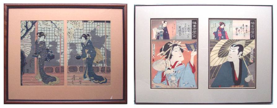
Framed Examples of Two Diptychs, using "Individual Windows"
Framed Examples of Triptychs, using "Single Window" and "TRIPLE-matting"
Detail of Triptychs' "TRIPLE-matting"
Other Applications--Let's Just Have Some Fun.....
Once you've mastered the matting and framing basics as covered above, you can then of course bend the rules just a bit and begin to simply have some creative fun. For example, several years ago after returning to Oregon following a 1995 21-day. 1000 mile solo bicycle trip of Japan, this author had the challenge of "how best" to frame and display an "oval 'kabuki' portrait" done by the artist Kunisada. It was a VERY inexpensive (only 1,500 yen--about US$12.00) piece due to its wormage, staining, and tattered edges--but nevertheless, due in part to the circumstances of which it was found, it had become a print very "dear" to this author's collection.
The "problem" of the print's very badly damaged edges--which would "normally" be solved by matting OVER the damages--was solved by the decision to simply "show all." Hey, it WAS clearly an "old print," and so it was decided to therefore simply show off all of its warts and other signs of aging in their full glory. And since this sad (but proud) sheet refused to "lay flat" against it's back-matting (without a front mat to help "hold down" all its edges which were to remain exposed), it was next decided to then simply allow the portrait to simply "float" within its frame. This effect was easily achieved by using a slightly smaller back-matting of 1/4 thin foam-core material which was placed (hidden) behind the print itself; the print then seemingly left to "float" forward in the framing space. Totally as an afterthought then, this later seemed very appropriate: These are, after all, known as "ukiyo-e," or "pictures from the 'floating world'." And one final point is herein made--due to the "charm" of this aged print, it has become one of the most highly prized pieces in this author's personal collection--despite the fact that it is one of the most inexpensive prints I've ever purchased. Here's how it turned out.
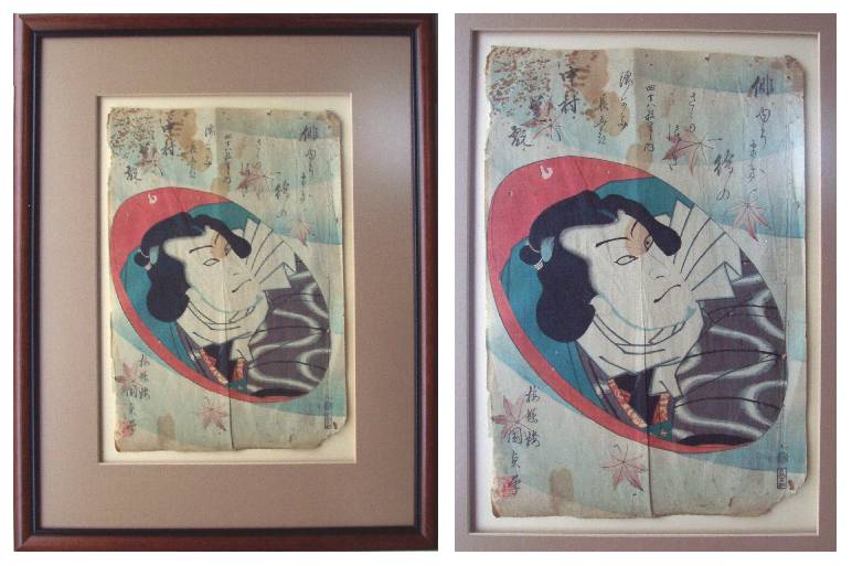
Framed Example of a Picture from the "Floating World" (plus close-up of print detail)
A final couple of examples will now be given to the reader/collector to perhaps show some additional ideas which may be useful or thought-inspiring. The first (left) is the case of the numerous smaller sheets which are often available to collectors, many of which can be found as "small diptychs" within "manga" or "ehon" Japanese woodblock-printed books. Again, often these paired-sheets will suffer from edge damages, but their images can be both inexpensive and delightful. Again, with the use of a small 12 x 16 inch frame, such print-pairs can be easily and attractively displayed with the simple use of a "double-window" cut into the matting. This can also be done--with the two "windows" set slightly wider apart--in the case of "similar" (but not truly matched) images such as perhaps two small "shunga" (erotic) prints or the like. Consider, for example, the case of the "Meiji-era diptyich" previously seen above. Although these two Kunichika "kabuki" images seen framed together are from the same print "series," they are not really "meant to be together as a diptych." Hence, they were therefore set a bit "further apart" within their matting with the use of a 2-inch vertical "bar" between them. So simply remember, place multiple-print image sheets closely together to achieve "continuity of image," but set similar image pairs a bit further apart if they are not truly a part of the same image.
The last little framed piece seen below (right) is perhaps getting a bit further away from the framing of Japanese prints, but is given as yet another example of some of the creativity which can be used when framing Japanese artworks. It is simply the use of a small "shadow box" (about 2-inches deep) into which a small collection of antique Japanese coins and Japanese hair-pins are displayed. Within the frame, we also employed a small "picture within the picture"--a small 3 x 4 inch woodblock print showing a "geisha" proudly wearing her hair ornaments. Here--the point being--to simply "have fun" and "be creative" in your use of framing when it comes to Japanese art.
When it comes to displaying art, don't be afraid to experiment. By all means, feel free to step "outside" of what is considered to be normal and to try new ways of looking at how you can display your artworks.
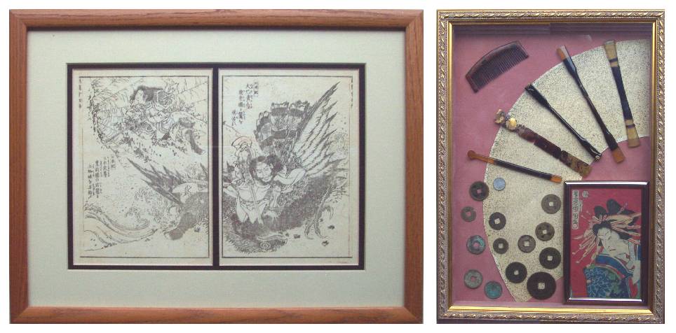
Framed Example of "Manga Pair" and use of a "Shadow Box"
A Few Concluding Remarks
Hopefully, we have not only given collectors some basic guidelines as to what might "look good" when they're faced with the decision of how to frame a given Japanese print, but also perhaps in a few cases we've also given them some insights into what can be achieved (or overcome) with a bit of creativity.
In summary, when going off to the frame shop, it is best to usually hold one thought in mind: Keep it simple--Don't let the matting or framing over-power the natural beauty of Japanese woodblock you are wanting to exhibit. Again, usually this means: (1) a simple (often black) frame, (2) a largely neutral-color wide "face mat" (often using the print's natural "paper color"), and (3) the use of a narrow "trim mat" color (either black, or one of the print's secondary colors). If you keep these "framing basics" in mind, the results will be attractive and can be enjoyed knowing that they will stand the test of time.
As a final reminder, always keep in mind that likely YOU will not be the "end owner" of the print you are about to frame. Although you may be given the privilege of enjoying "your" Japanese print within the immediate present, someone of a future generation will some day be the recipient of your art treasures. Therefore, treat them with respect (acid-free materials, etc) and demand that your framer do the same.
As we often say, "Enjoy your prints!!"
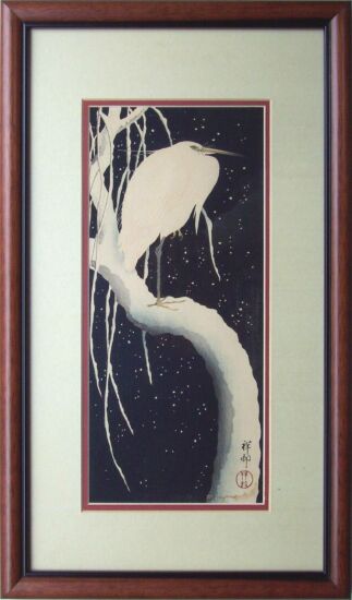
Koson's "Egret on a Snowy Branch"
Addendum--A Final Comment about "UV-Shielding Glass"
The question of whether or not to use "UV-shielding glass" to protect one's Japanese print collection is often asked of us. To the reader who has not yet read our article which we believe largely DIS-credits the value of "UV-glass," we have only one thing to say. Bottomline--DO NOT RELY ON "UV-shielding glass" to protect your collection.
Although not precise or scientific, we recently devised a simple and easily understandable experiment which we believe has PROVEN that "UV-shielding glass" offers at best a very minimal degree of protection from sun-fading exposure. Further, it now seems obvious to us that collectors who rely on "UV-shielding glass" to protect their prints are being seriously mislead by largely false claims of the "protection" offered. To read more, and to then make up your own mind, please see our earlier article titled "Sun-Fading and UV-Glass Experiment (A Case Study).")
(All of the artwork examples exhibited above are from the personal collections of authors Thomas Crossland and Dr. Andreas Grund.)
(c) Thomas Crossland and Andreas Grund, December 2002
Gallery
Terms
Ordering
About Us
We Buy Prints
Library

Free counters provided by Andale.