The "Doi Dilemma"

(A Case Study in Progress)


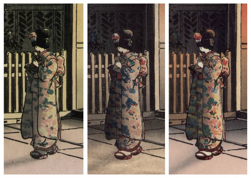
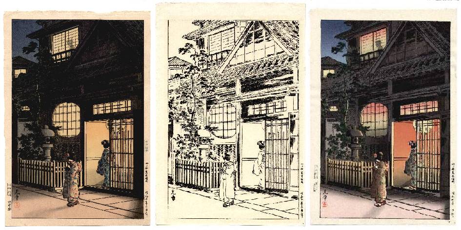
Koitsu's "Tea House at Night" (1935) -- "Hanshita" for "Tea House at Night" -- Koitsu's "Tea House at Night" (1956-62)


Introduction--Doi Publisher's "Tea House at Night" Print by Koitsu

Above you see illustrated what simply appears to be two colored versions of Doi's popular "Tea House at Night" print sitting each side of this same print's "hanshita," or "key-block" outline. For completeness, this print is correctly titled "(Tea House) Yokocho at Yotsuya Araki" (in Japanese, "Yotsuya Araki Yokocho") and is margin-dated and therefore originally first published in "Showa 10 January," or January 1935. So already you're probably asking, "What's the big deal...?" Well, that's what I first thought a couple of months ago when I first received the paler-colored print seen on the right. In fact, for several weeks I didn't even notice that the arrival of this newly acquired print was raising.......


A "Doi Dilemma"

What then began as a casual, but somewhat more careful examination of this additional print yielded quite a surprise. Not only were the "printer's seals" different AS ONE WOULD EXPECT with different vintage printings of the same print--but also, to my considerable surprise, I soon discovered that the "carver's seals" were different as well. For the understading of readers, let me explain a bit further.

With most "shin-hanga" prints, generally speaking the Japanese kanij "titles" and "margin-dating" (seen variously in either a print's right or left margins) are both carved INTO and thusly become a permanent part of the print's black "key-block." A good example of this is, in fact, the black and white "hanshita" of this same print seen in the "Tea House" print above. Here we see, in the typical Japanese format, the "kanji title" is seen just above the "kanji margin-dating" which appears just below. In practical terms, what this of course means is then that ALL print's struck off of such "key-blocks" will bear this "original date," regardless of the edition or the actual date of their printing. (One "exception" is the case of later Kasamatsu and Asano prints published post-1960 by Unsodo Publisher of Tokyo. In their case, such later "strikes" lack any signs of margin-dating, since these were permanently carved off of their "key-blocks" after Kasamatsu and Asano ended their association with Unsodo. (For more about Unsodo's prints, you can visit our article about "Old Paper.")


"Tea House at Night" (1935)                               "Tea House at Night" (1956-62)

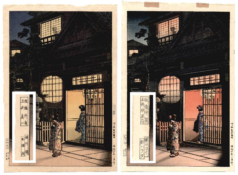
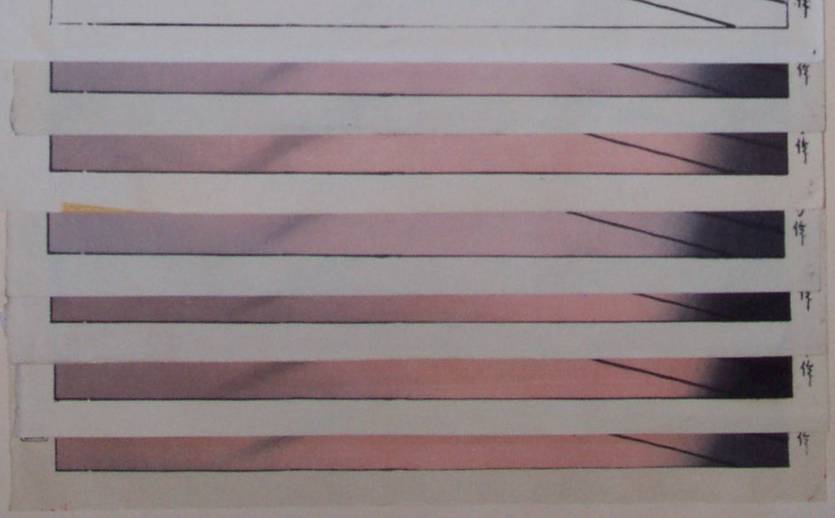
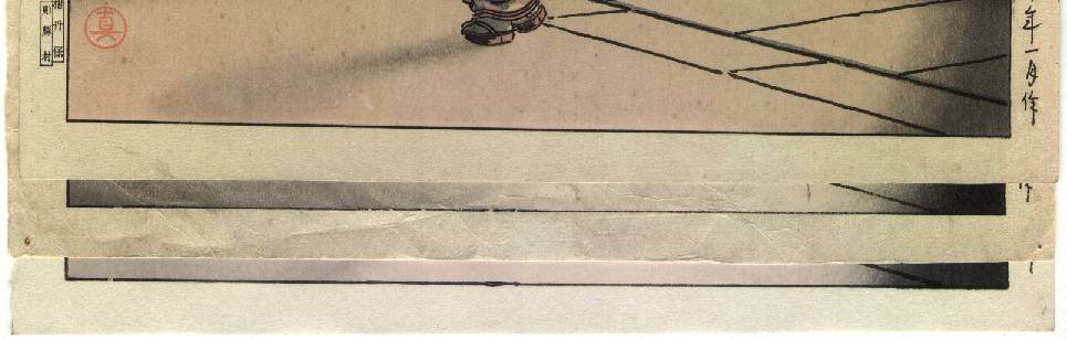
carver/printer: Katsumura/Tanbo                                       carver/printer: Harada/Yokoi


Not at all then surprising is the frequently encountered situation where various editions of a given print are seen to bear different PRINTER'S seals. This occurs, of course, because earlier printers are subsequently replaced due to their deaths or retirements. In this case, the brighter "Tea House" print on the right bears the typically encountered carver/printer seals of Harada/Yokoi. Harada's "carver seal" appears on a great many of Doi's prints, certainly as early as 1932, consistent with what one would therefore expect on a 1935 print. In combination with the presence of Yokoi's "printer seal" (and the "Doi Hangaten" publisher's seal) then indicates that this particular Doi print was printed by Yokoi during the 1956 to 1962 period (see seal "E" in our Quick Reference on "The Doi Publishing House.")

The big surprise came upon the discovery of entirely different "printer" and "CARVER" seals on the newly acquired (seemingly more faded) print seen on the left. With the assistance of my Japanese wife's (Hisako) reading of these new seals, it was immediately determined that these carver/printer seals were that of Katsumura/Tanbo. Katsumura is one of Doi's earliest and more obscure artisan carvers, who is know to have worked for Doi only during the very early 1930's. The accompanying printer, Tanbo (or Tanpo?), remains unknown.

Accordingly, the initial "seemingly obvious conclusion" was that the "brighter" print was simply the product of an entirely re-carved set of blocks. Of course, the "printer's name" COULD logically be expected to change over the years, but the original carver's name should ALWAYS remain the same with any and all subsequent editions. After all, certainly it would be impossible for two differnet carvers to have carved the same blocks.


Detail Katsumura/Tanbo's "Tea House"            Detail Harada/Yokoi's "Tea House"

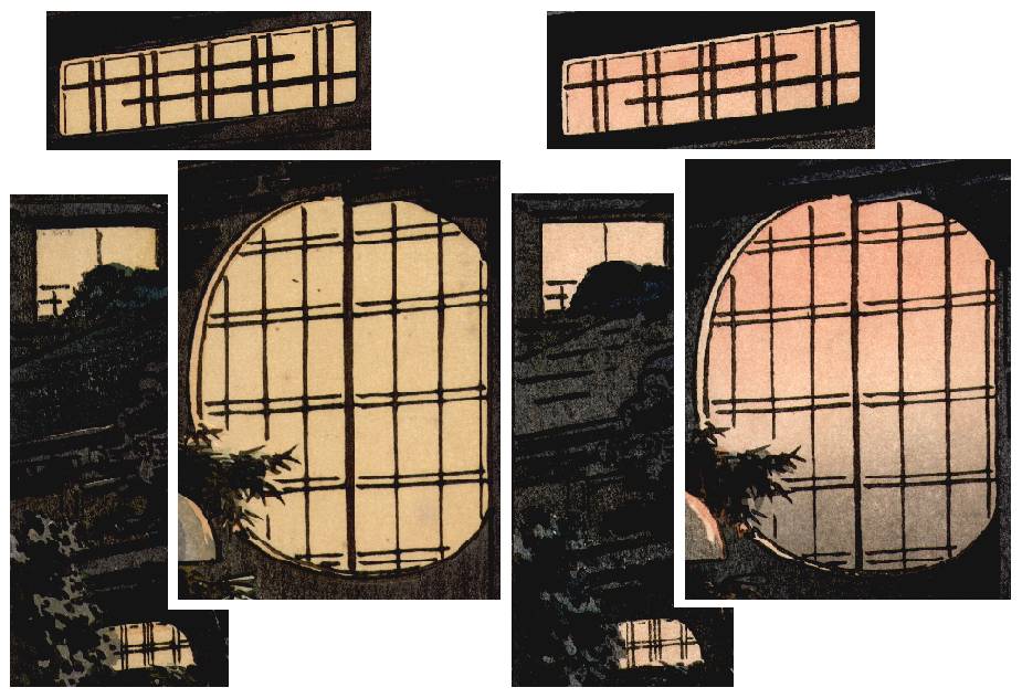
carver/printer: Katsumura/Tanbo           carver/printer: "Harada"/Yokoi


But....the "Key-lines" are the Same

This is where the powers of close observation can sometimes yield surprising results. In this case, a close magnified "line-by-line" comparison of both prints quickly yielded the conclusion that the "key-block" BLACK outlines seen in both prints are IDENTICAL. They both match each other in addition to the same "key-block" lines seen in the center black and white "hanshita" print pictured just below. The reader himself/herself should readily be able to reach this same conclusion by comparing many of the unique "bumps," "curves," or "thick spots" that are clearly visible in BOTH of the color prints picured above. It's quite simply physically impossible to re-carve a second identical "key-block" that is identical in all these nuances.


Detail "Tea House" black and white "Hanshita"


Of course then the obvious conclusion if both print's "key-lines" are IDENTICAL--much like an person's unique fingerprints or DNA--is that it is therefore impossible that BOTH Katsumura and Harada could have carved these proven same blocks.


(Differences Seen in the "Cast Shadows")

It is further productive to mention at this point the "bokashi" shading seen as "cast shadows" in the forground of both prints. Here, as the observant reader may have already noted, the "angle" or "slope" of the blackish shadows seen cast upon the pavement (and in the extreme lower right corner) ARE different in both prints. However, these differences are normal and to be expected--since such "bokashi shading" is achieved by the hand-wiping of printing inks upon a broad-surfaced woodblock in order to achieve this printing effect. In other words, these "shadows" seen are NOT achieved via carving; but rather by the hand-application of inks to a woodblock. Thusly, such variations seen here from print to print are to be expected and are NOT the result of carving.


Possible Explainations....

Unlike a print's title and margin-dating which are permanently carved into the "key-blocks" margins, the accompanying "publisher's seal" and "carver/printer seals" seen in most "shin hanga" prints are removable. They are NOT a permanent part of the "key-block." Known as "koma," these delicately carved rectangular seals are simply inserted into holes cut into the "key-blocks" margins.

In this case then, the seemingly "most likely explanation" is that Katsumura is indeed the SOLE carver of this fine print. Thirty-some years later then, when Doi found the need to produce an additional run of this image, there's perhaps a very good chance that NO (correct) "seal combination" of "Katsumura/Yokoi" existed. These "paired offset seals" are carved together at the same time, as a single "koma" pair. Very likely then, Doi simply choose from among the various existing "seals" that were immediately on-hand, using the (correct) "Yokoi" printer's seal that just happened to have Harada's (incorrect) name as the carver.

Another further possible explanation could be that a PARTIAL re-carving may have been done by Harada. It is possible that perhaps one or more of the "Tea House's" blocks could have become cracked, badly worn, or in some other way become unprintable. If so, Harada may have then been asked to re-carve a new woodblock--and hence, his name could then perhaps correctly be deemed to correctly appear alongside Yokoi's on these later strikes. However, I seriously doubt this scenario, since it would most likely be the narrow black "key-block's" lines that would first show degradation due to excessive wear. However, since both print's "key-block" lines now appear to be identical, this scenario seems unlikely.


Concluding Remarks


It is (at this point) this author's conclusion that most likely later "Tea House" prints which most typically bear the "carver/printer" seal combination of "Harada/Yokoi" are INCORRECTLY sealed. Instead, it is my belief that in both cases (earlier and later editions) the blocks are IDENTICAL and that the "correct" (non-existing) "carver/printer" seal should read "Katsumura/Yokoi." However, all of this involves a good amount of guesswork and speculation, since we are herein attempting to explain prints produced by Doi some 40 to 70 years ago. Most of the artisans of this period are long since deceased, and of those that remain, their collective recollections are now growing dim. Most likely we'll never know for sure.

Further close comparisons of additional prints may yield further information, including perhaps the possibility of some partial block re-carving. As is typically the case, further research remains to be done.

Demonstrated here for the reader are the powers of close observation coupled with small amounts of deductive reasoning to arrive at reasonable explanations to otherwise apparently unexplanable observations. In any case, the hands-on appreciation of Japanese woodblocks remains an always an intersting pursuit.

Enjoy your prints!!


A Work in Progress....


(Some uncertainty does remain as to the conclusions reached in this article--and for this reason, the reader may in the near furture see some revisions or updates reported to this article as additional information is obtained. As with many areas of research and the study of Japanese woodblock prints, it is a work in progress.)


(Copyright March 2002, Thomas Crossland. All rights reserved.)


June 2002 Update--Using 9 Color Copies of "Tea House" Print

On May 30 2002, my good friend and fellow "shin hanga" print enthusiast, Marc Kahn and I got together to closely examine our mutual "accumulation" of 9 various color copies and 1 black/white "hanshita" (key-block copy) of Doi Publisher's Koitsu "Tea House" print. (Marc, as many of you know, runs a wonderfully produced website where he's painstakingly posted his considerable research and accumulated knowledge about the popular shin hanga artist, Takahashi Hiroaki--more commonly known by his "artname," Shotei. Of course, it's called "Shotei.com.")

As you can see, we spread out our 9 color copies of different "vintages" across the dining room table, and with magnifying glass in hand set out looking for both similarities and differences. Here's what we found out.....


Marc Kahn with Our "Tea House" Prints                Close-up of sets "A" (top, 1 print), "B" (next 2), and "C" (bottom 7)


The Earliest Print (Example "A")

The earliest printing of our 9 prints was clearly the very "crisp" and softly orange-colored version that was sealed using the carver/printer combination of Katsumura/Tanbo. Again, Katsumura was one of Doi's earliest artisan carvers (worked for Doi only during the very early 1930's) and printer Tanbo (or Tanpo?), remains apparently unknown. Most striking and obvious about this print was the thinness and entirely UN-broken lower "key-line" border. In other words, any signs of block-wear are not apparent. Also convincing "evidence" of the very early printing of this copy is its light blue (upper right) margin seal which reads "Tokyo Fukei," or "Scenes of Tokyo" series. This same blue margin seal is also seen on all of the (early) "oban" Koitsu prints shown in the 1999 Chigasaki Museum's Koitsu Exhibition reference. Finally, the red, round "Koitsu" seal is also unique to this single print.


Example "A"--The Single Early Print--Note the "crisp," unbroken lower margin's "key-line."


Example "B" Set

Next in "unmistakable similarity" were the two copies bearing the carver/printer combination of Harada/Yokoi in their lower left margins. Clearly evident in both of these prints were a series of unique "breaks" and other similar "thick/thin" line areas seen in their "key-block's" lower margin.


Example "B" Prints--Note the identical series of "breaks" in their lower margin's "key-line."


Example "C" Set

Finally, ALL of the remaining 6 color prints and the black/white "hanshita" were then observed to have their own common, but again unique set of line "breaks" and "thick/thin" line areas evidenced clearly in their "key-block's" lower margins. And don't be fooled by this Set "C's" apparent similarities to the above Set "B's" margin "key-line." If one looks closely and compares, he/she will note that these two sets ("B" and "C") are quite different.


The 7 Example "C" Prints--Note the identical "breaks" and "thick areas" common to ALL lower margin's "key-lines."


Our Theory and Conclusion

Having both talked this "key-block" matter over previously with experienced printmaker David Bull of Tokyo, Marc then recalled David's mention of the distinct possibility that Doi Publisher may have, in fact, at some point produced "exact duplicate" METAL "key-blocks" of some of their most popular print images. The technology and know-how certainly existed during the 1920's and 1930's by which a zinc plate etching could have been subsequently produced at a later time by Doi using a single black and white "hanshita" copy to do so. According to our theory based on the accumulated evidence left to us in the form of prints, by the time this was done, the then-printed black-ink "hanshita" already showed signs of blockwear with the "breaks" shown above. It further seems evident that at this time some effort was made to "repair" these "key-line" breaks, but in doing so, the repairs then show as "wider lines."

To briefly explain, producing this metal plate simply involves a photo-mechanical process whereby the desired image is projected onto a metal plate which is then chemically etched. This practice is well documented in the case of ALL of Hiroshi Yoshida's prints, where in EACH case Hiroshi's "key-blocks" were produced using a zinc metal plate etching rather than having been carved from wooden blocks. (See Abe's reference, "The Complete Woodblock Prints of Yoshida Hiroshi," page 175, plates #1 through #7, where this is both illustrated and stated as "an overlaid zinc relief plate.") By this means, the Yoshida Studio was able to apparently avoid the future problems of block-wear that can otherwise occur with carved wooden blocks over many repeated editions.

Noting that many of the other black "key-lines" found WITHIN the images of ALL of our 9 + 1 prints appear to be similar--but noting the apparently worrisome block-wear evident in the lower margins of our 2 "B" prints--it is our belief that at THIS point Doi then choose to print a (then somewhat worn) black/white "hanshita" and used it to manufacture a zinc plate copy to use for all further (Set "C") copies. In other words, by doing so Doi would at least avoid any further damaging block-wear to this obviously popular print.


Top to bottom, "A," "B," and "C" Prints--Note the where the "breaks" in "B" became repaired "thick areas" in "C."


Additionally, in doing so it appears that several of the "breaks" seen in the lower margin of the "B" prints were REPAIRED in the process, resulting in the "thicker" sections of lines seen in the "C" prints lower margins. As a result, the "C" set developed its own unique lower margin "fingerprint." This seemingly later 6-print set then appears to represent a fairly wide period of time, as 2 of these prints bear the seals of Harada/Yokoi (used until 1962 or 1965), while the other "unsealed" 4 appear to be even more recent. However, any additional block-wear is NOT apparent--further supporting our theory of a metal key-block plate in use.


The Color Blocks Also "Tell a Story"

Finally, (based on the earlier urgings made by David Bull) our attention lastly turned to the COLOR blocks and the accumulated evidence that they've also left for us to study. Here, using the unique "patterns and shapes" (not colors, which are changeable) seen in the kimono pattern of the foreground girl, we quickly determined the single "A" print's COLOR blocks to be unique. Without any doubt, the set of color blocks used to print this earliest print are clearly different from all of the other 8 color prints. One print from each of the "A," "B," and "C" Sets are shown just below.


Left to Right--"A" kimono (unique pattern) and IDENTICAL "B" and "C" kimono patterns.


Continuing our painstaking examination of all of the other 8 prints (2 of the "B" Example Set and 6 of the "C" Example Set), we determined that both the "B" set and the "C" set appeared to share the use of common COLOR blocks. This, despite the obvious differences in the "B" and "C" set's black key-blocks. So apparently, the more WIDELY-carved surface areas of the color blocks held up well over time.

Our conjecture then is that very early in the mid-1930's something (fire or perhaps other damage) happened to the original color blocks that required their replacement. But, as demonstrated earlier in this article, the black "key-block" usage appears to remain consistently printed from the same block (or later zinc metal plate copy thereof).


Conclusion (and a Caveat)

We trust that our readers will accept the unavoidable fact that much of this article's possible "conclusions" are based on both speculation and guesswork arising and resulting from our observations of the subject prints on hand for our study, coupled with "some understanding" of the printing process. We also wish to again remind the reader that most if not all of Doi Publisher's artisans working in the 1930's period are now deceased or are very old, so they cannot be relied upon to provide additional information. Finally, any re-carving (or even the possible occasional use of metal plate "key-blocks") may well understandably be a "taboo subject" about which various Japanese publishers may not wish to talk openly or even acknowledge at all. With the further passage of time, likely we'll never know for certain.


Copyright June 2002, Thomas Crossland. All rights reserved.

(The author also wishes to acknowledge the considerable contributions of Marc Kahn to this research, as well as the invaluable insights provided by Tokyo's master printmaker, David Bull.)


Gallery   Terms   Ordering   About Us   We Buy Prints   Library